
概要
どうも、@daiki1003です!さて、皆さんに一つ質問です。
FlutterのWidgetって、パラメタ多すぎじゃありません?笑
そんな、あなたに朗報です。
このブログを始めとする解体新書シリーズを読めば
何を指定したら何が変わるのか、理解出来る様になります。
一度で理解できなくとも、辞書の様に困ったら何度でも見に来てください。
あなたの手助けをしてくれることでしょう。 (だといいな)
そんなブログがあれば良いなと執筆を始めました。
解体新書というのは、杉田玄白さんという方が、
まだ医学の知識が広まっていなかった時代に
西洋医学の翻訳書としてしたためた本で、全4冊です。
杉田玄白さんはこれを多くの方の協力で作ったみたいですが
僕は一人でやり切ります。ドヤァ😎w
さぁ、そんなどうでも良い話はおいといて早速行ってみましょー!
執筆時環境
Flutter 2.2.3 • channel stable • https://github.com/flutter/flutter.git
Framework • revision f4abaa0735 (2 weeks ago) • 2021-07-01 12:46:11 -0700
Engine • revision 241c87ad80
Tools • Dart 2.13.4
初期設定
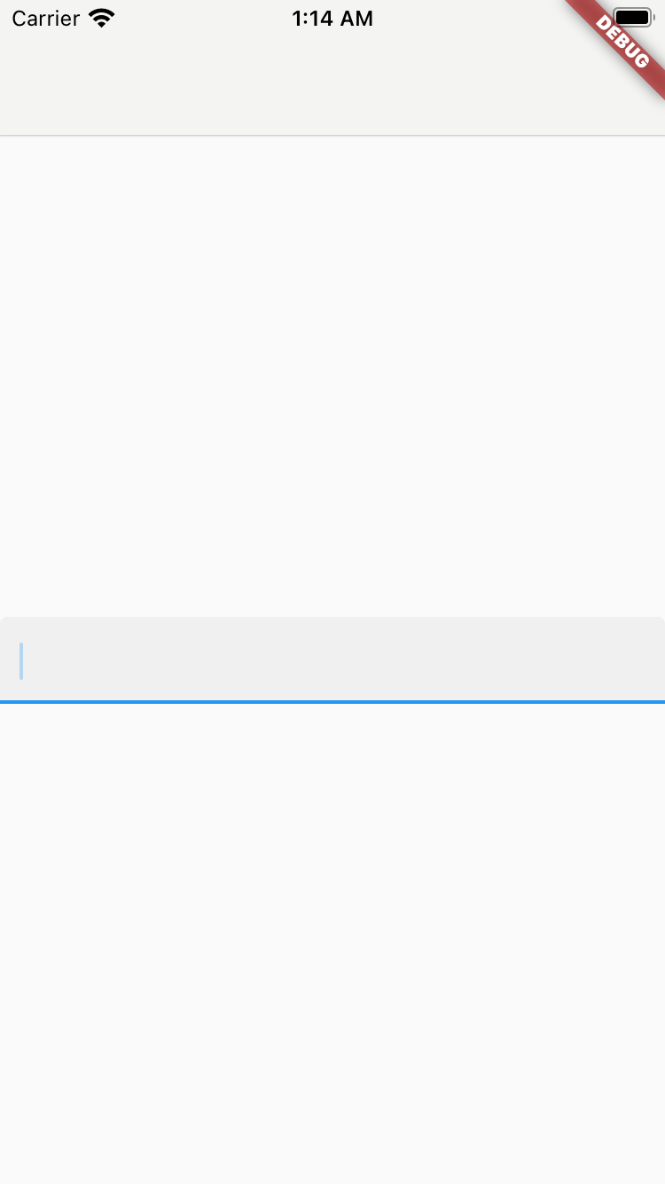
まずは、画面中央にデフォルトのTextFieldを表示してみます。

見えてるのは、線ですがこれは入力欄の下線です。
Widget? icon
InputDecoration(
  icon: Icon(Icons.ac_unit),
)

iconとは言っていますが、 IconではなくてもOKです。
String? labelText
InputDecoration(
  labelText: 'labelText',
)
| 非選択時 | 選択時 |
 |  |
TextStyle? labelStyle
InputDecoration(
  labelText: 'labelText',
  labelStyle: TextStyle(
    color: Colors.red,
  ),
)
| 非選択時 | 選択時 |
 |  |
String? helperText
InputDecoration(
  helperText: 'helperText',
)

TextStyle? helperStyle
InputDecoration(
  helperText: 'helperText',
  helperStyle: TextStyle(
    color: Colors.red,
  ),
)

int? helperMaxLines
InputDecoration(
  helperText: 'helperText',
  helperStyle: TextStyle(
    color: Colors.red,
    fontSize: 20,
  ),
)

InputDecoration(
  helperText: 'helperText',
  helperStyle: TextStyle(
    color: Colors.red,
    fontSize: 20,
  ),
  helperMaxLines: 2,
)

String? hintText
InputDecoration(
  hintText: 'hintText',
)
| 非選択時 | テキスト入力時 |
 | < /td> /td> |
このTextFieldが何を入力するものなのかを表示するのによく使われます。
ユーザーが何かを入力したら消えます。
TextStyle? hintStyle
InputDecoration(
  hintText: 'hintText',
  hintStyle: TextStyle(
    color: Colors.red,
  ),
)

TextDirection? hintTextDirection
InputDecoration(
  hintText: 'hintText',
  hintTextDirection: TextDirection.rtl,
)
| 未指定 | rtl |
|  |
int? hintMaxLines
InputDecoration(
  hintText: 'hintTexthintTexthintTexthintTexthintTexthintText',
  hintStyle: TextStyle(fontSize: 20),
)

InputDecoration(
  hintText: 'hintTexthintTexthintTexthintTexthintTexthintText',
  hintStyle: TextStyle(fontSize: 20),
  hintMaxLines: 2,
)

String? errorText
このerrorTextが指定されていると、TextFieldのdecorationは「エラー状態の表示」になります。
InputDecoration(
  errorText: 'errorText',
)

TextStyle? errorStyle
InputDecoration(
  errorText: 'errorText',
  errorStyle: TextStyle(color: Colors.blue),
)

int? errorMaxLines
InputDecoration(
  errorText: 'errorTexterrorTexterrorTexterrorTexterrorText',
  errorStyle: TextStyle(fontSize: 20),
)

InputDecoration(
  errorText: 'errorTexterrorTexterrorTexterrorTexterrorText',
  errorStyle: TextStyle(fontSize: 20),
  errorMaxLines: 2,
)

FloatingLabelBehavior? floatingLabelBehavior
InputDecoration(
  labelText: 'labelText',
  floatingLabelBehavior: FloatingLabelBehavior.always,
)
未選択時
| null | auto | always | never |
 | |  | |
選択時
| null | auto | always | never |
 | | |  |
bool? isDense
| null or false | isDense: true |
 |  |
defaultはfalseです。
EdgeInsetsGeometry? contentPadding
InputDecoration(
  contentPadding: EdgeInsets.symmetric(horizontal: 16),
)
| 未指定 | symmetric(horizontal: 16) |
 |  |
InputDecoration(
  isDense: true,
  contentPadding: EdgeInsets.symmetric(horizontal: 16),
)

InputDecoration(
  isDense: true,
  contentPadding: EdgeInsets.all(16),
)

ご覧のように、 isDenseであっても、contentPaddingが優先されます。
bool isCollapsed
InputDecoration(
  isFilled: true,
  isCollapsed: true,
)
| 未指定 | isCollapsed: true |
 |  |
様々な余白が消されます。
また、isCollapsedをtrueにした場合、labelText, errorText, iconは無効になります。
その場合、InputDecoration.collapsedコンストラクタを使えば、
これらが指定出来なくなるので意識しなくても済みます。
Widget? prefix
InputDecoration(
  prefix: Text('This is prefix'),
)
| 非選択時 | 選択時 |
 |  |
選択時に指定したウィジェットが表示されます。
後述するprefixTextとの同時指定は許されていません。
String? prefixText
InputDecoration(
  prefixText: 'This is prefix',
)
| 非選択時 | 選択時 |
| |
挙動は上述の例と同じです。
TextStyle? prefixStyle
InputDecoration(
  prefixText: Text('Test'),
  prefixStyle: TextStyle(color: Colors.red),
)

中で Text(prefixText, style: prefixStyle!)と使用されています。
そのため、prefixにTextウィジェットを指定してもprefixStyle適用はされません。
Widget? prefixIcon
InputDecoration(
  prefixIcon: Icon(Icons.ac_unit),
)
| 非選択時 | 選択時 |
 |  |
InputDecoration(
  prefixIcon: Icon(Icons.ac_unit),
  prefixText: 'Test',
)

ちょっとずれるな?
BoxConstraints? prefixIconConstraints
InputDecoration(
  prefixIcon: Icon(Icons.ac_unit),
  prefixIconConstraints: BoxConstraints(minWidth: 64),
)
| 未指定 | minWidth: 64 |
 |  |
テキストの入力開始位置もその分ズレてくれます。
また、 contentPaddingとの併用は出来ず、こちらが優先される様です。
Widget? suffix
prefixの逆なのでサクッといきましょう。
InputDecoration(
  suffix: Text('This is suffix'),
)
| 非選択時 | 選択時 |
 |  |
String? suffixText
InputDecoration(
  suffixText: 'This is suffix',
)
| 非選択時 | 選択時 |
| |
TextStyle? suffixStyle
InputDecoration(
  suffixText: 'This is suffix',
  suffixStyle: TextStyle(color: Colors.red),
)

Widget? suffixIcon
InputDecoration(
  suffixIcon: Icon(Icons.ac_unit),
)

BoxConstraints? suffixIconConstraints
InputDecoration(
  suffixIcon: Icon(Icons.ac_unit),
  suffixIconConstraints: BoxConstraints(minWidth: 64),
)

Widget? counter
InputDecoration(
  counter: Icon(Icons.ac_unit),
)

TextField右下に表示されます。
String? counterText
InputDecoration(
  counterText: 'counterText',
)
| 非選択時 | 選択時 |
 |  |
TextStyle? counterStyle
InputDecoration(
  counterText: 'counterText',
  counterStyle: TextStyle(color: Colors.red),
)

bool? filled
InputDecoration(
  filled: true,
)
| 未指定 | filled: true |
 |  |
TextFieldの占有区間に背景色が適用されます。
デフォルトでpaddingが付与されるようです。
また、
InputDecoration(
  filled: true,
  icon: Icon(Icons.ac_unit),
  suffixIcon: Icon(Icons.ac_unit),
  labelText: 'labelText',
  counterText: 'counterText',
)
のようにiconを指定してもfillされません。

prefixIconはfillされます。
InputDecoration(
  filled: true,
  prefixIcon: Icon(Icons.ac_unit),
  suffixIcon: Icon(Icons.ac_unit),
  labelText: 'labelText',
  counterText: 'counterText',
)

Color? fillColor
InputDecoration(
  filled: true,
  fillColor: Colors.red,
)

Color? focusColor
未使用になったみたいです。
Color? hoverColor
InputDecoration(
  filled: true,
  fillColor: Colors.red,
  hoverColor: Colors.blue,
)
参考画像用意出来ず…🙏
後述する、 enabledがtrueの状態でマウスホバーするとfillColorとhoverColorがブレンドされて表示されます。
bool enabled
InputDecoration(
  enabled: false,
  helperText: 'helperText',
  counterText: 'counterText',
)
| 未指定時 | enabled: false |
 |  |
InputBorder? errorBorder
InputDecoration(
  errorText: 'errorText',
  errorBorder: UnderlineInputBorder(
    borderSide: BorderSide(color: Colors.black, width: 2),
  ),
)
TextField未選択時のエラーボーダー設定です。

InputBorder? focusedErrorBorder
InputDecoration(
  errorText: 'errorText',
  focusedErrorBorder: UnderlineInputBorder(
    borderSide: BorderSide(color: Colors.green, width: 2),
  ),
)

TextField選択時のエラーボーダー設定です。
InputBorder? focusedBorder
InputDecoration(
  focusedBorder: UnderlineInputBorder(
    borderSide: BorderSide(width: 2),
  ),
)
| 非選択時 | 選択時 |
 |  |
InputBorder? disabledBorder
InputDecoration(
  enabled: false,
  disabledBorder: UnderlineInputBorder(borderSide: BorderSide(color: Colors.deepOrange)),
)

InputBorder? enabledBorder
InputDecoration(
  enabledBorder: UnderlineInputBorder(
    borderSide: BorderSide(color: Colors.yellow),
  ),
)

選択時には適用されません。
InputBorder? border
結論、使うことはなさそうです。
プロパティのコメントには、 errorBorder, focusedBorder, focusedErrorBorder, disabledBorderenabledBorderが指定されていない時に使われる、と書いています。
が、Flutter側によってborderSideはいじられるよとも書いていて深ぼって見るとcolorとwidthはcopyWithでうわがかれています。
この2つが使えないと、もはやほぼこのプロパティを使う意味はなさそうかなと言ったところですね。
String? semanticCounterText
InputDecoration(
  semanticCounterText: 'semantic',
)
Semanticsについては割愛します。
UIとして表出することはないです。
bool? alignLabelWithHint
InputDecoration(
  alignLabelWithHint: true,
)
こちらは特に変化は分からず…。
もしわかる方は教えてください。
テキストのベースラインを変更するっぽいのですが。
終わりに
はぁ…はぁ…。
いかがでしたでしょうか?
こんな感じで解体新書シリーズがある程度好評であればいろんなWidgetやプロパティについて
書いて行きたいと思っているので乞うご期待!
頑張ったねって少しでも思っていただけたら↓からコーヒーを少し奢っていただけると嬉しいです!
もちろん、強制ではありません笑

Twitterフォローお願いします
「次回以降も記事を読んでみたい!」「この辺分からなかったから質問したい!」
そんな時は、是非Twitter (@daiki1003)やInstagram (@ashdik_flutter)のフォローお願いします♪
Twitterコミュニティ参加お願いします
Twitterコミュニティ「Flutter lovers」を開設しました!参加お待ちしております😁
☕️ Buy me a coffee
また、記事がとても役に立ったと思う人はコーヒーを奢っていただけると非常に嬉しいです!


コメント